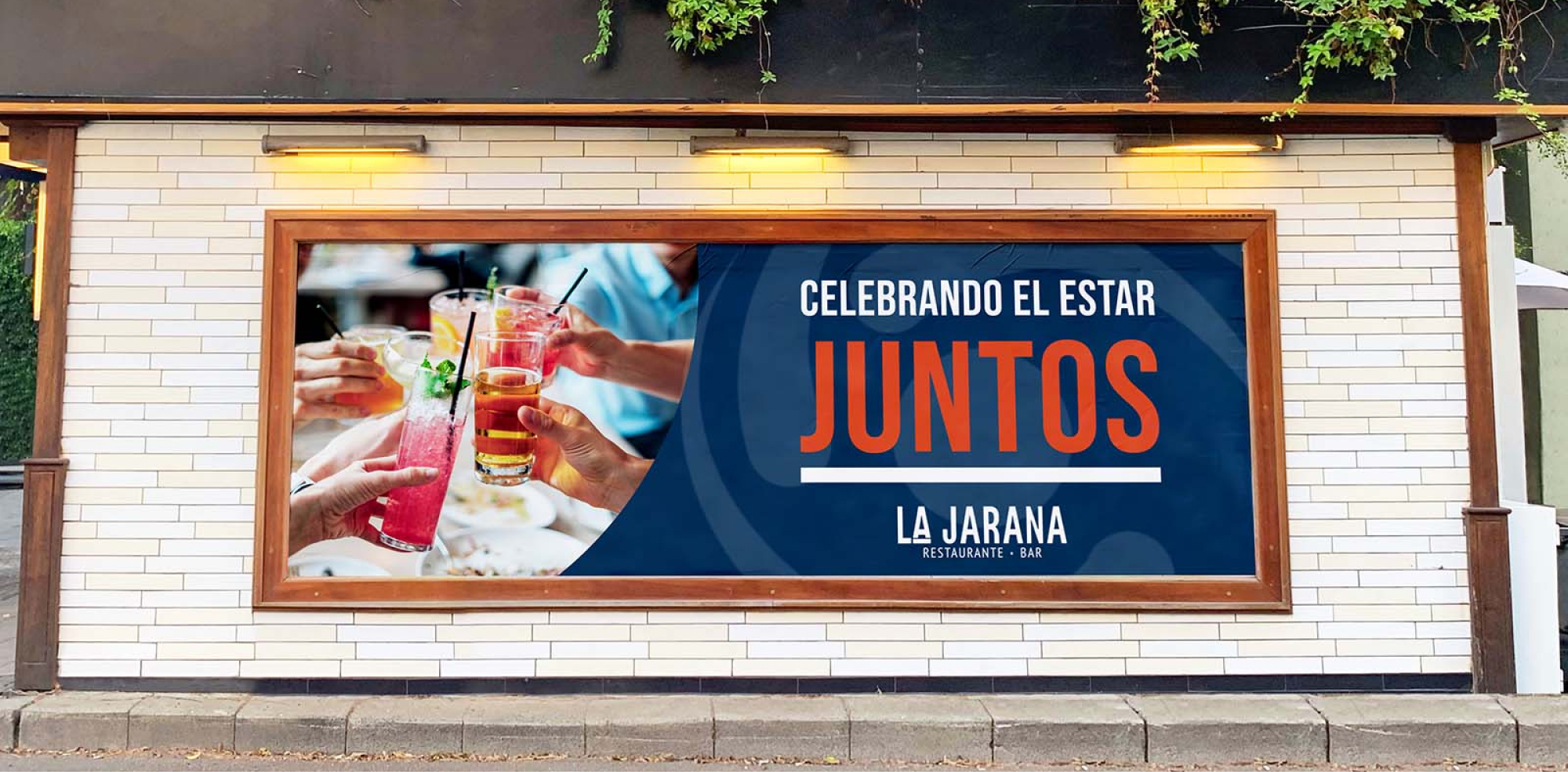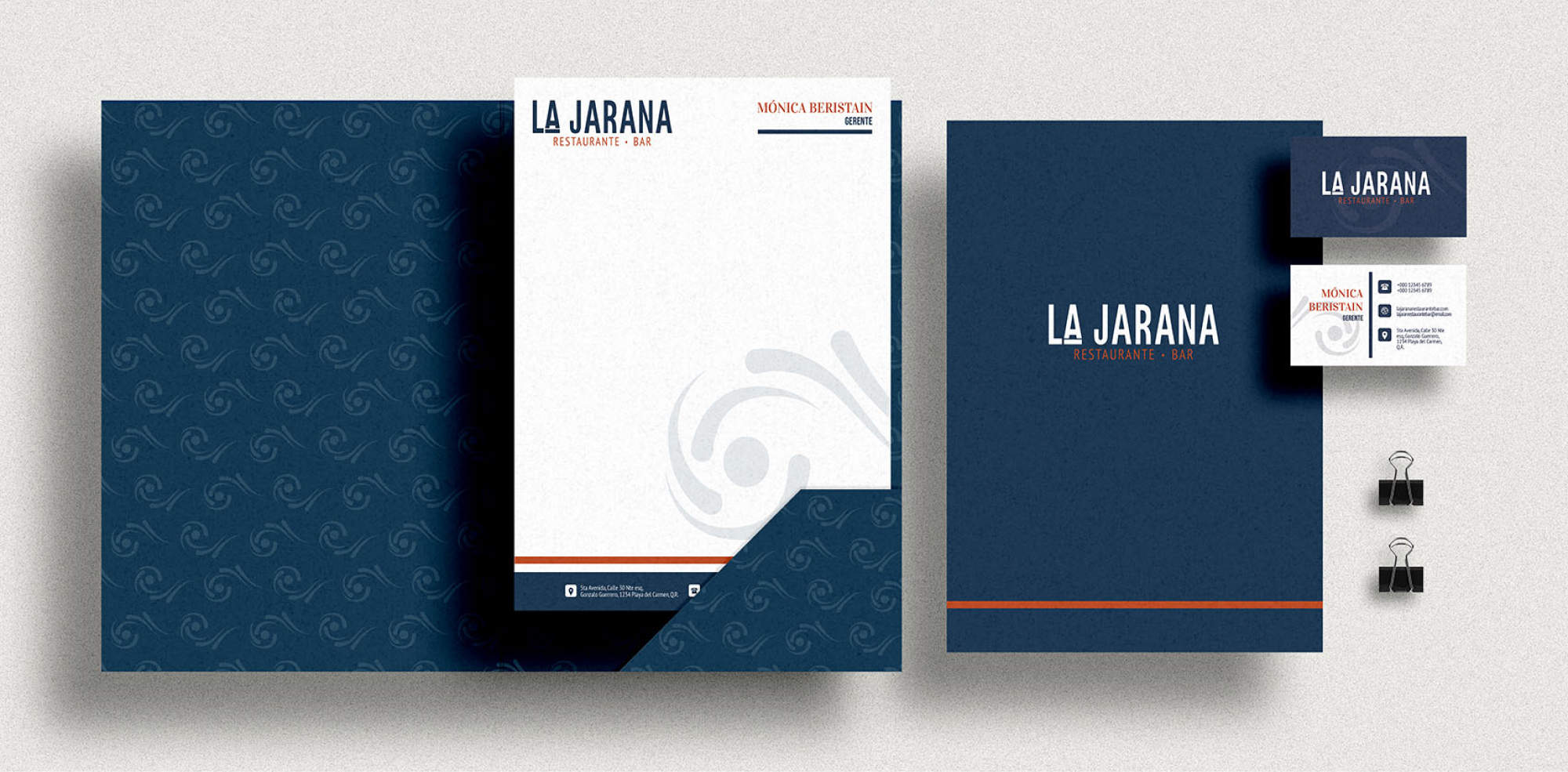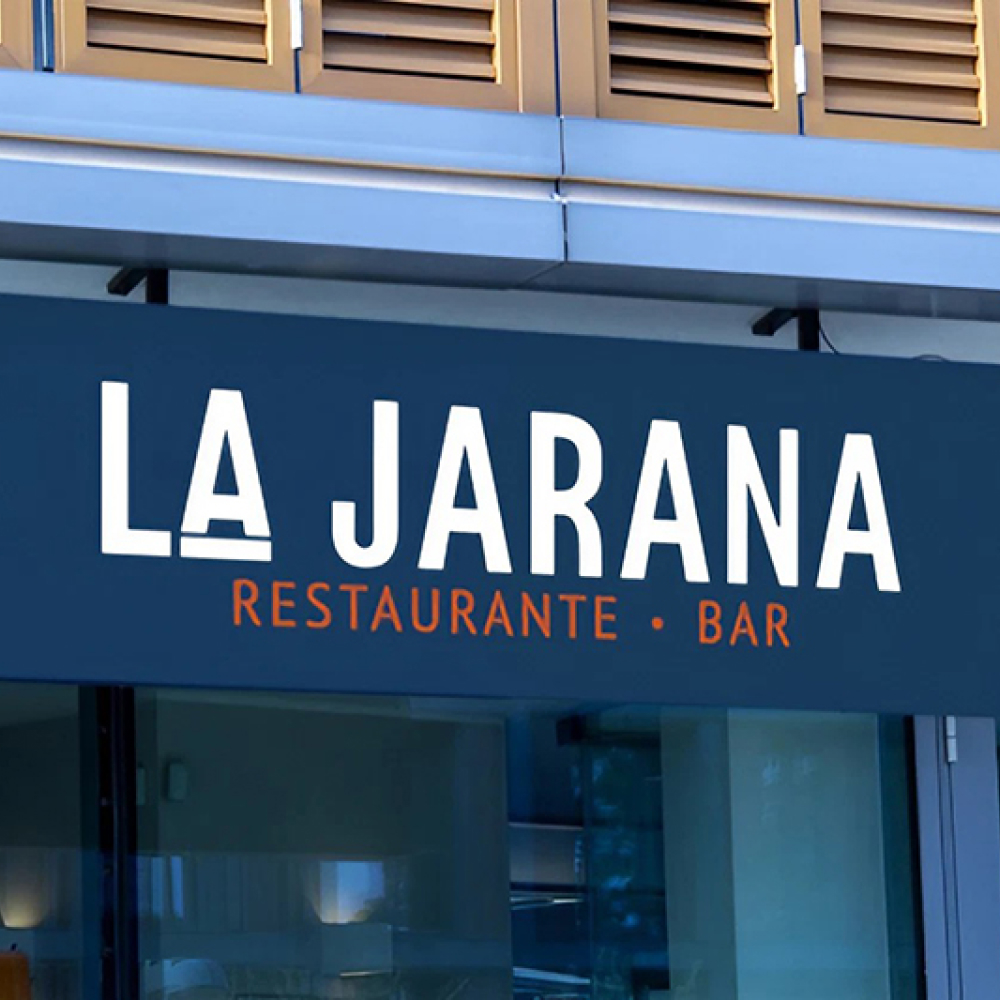
The word Jarana means, revelry and fun, this word reinforces the concept of the brand, which is to celebrate being together by sharing food, with this in mind, the logo was created with the purpose of communicating sobriety, modernism and quality.
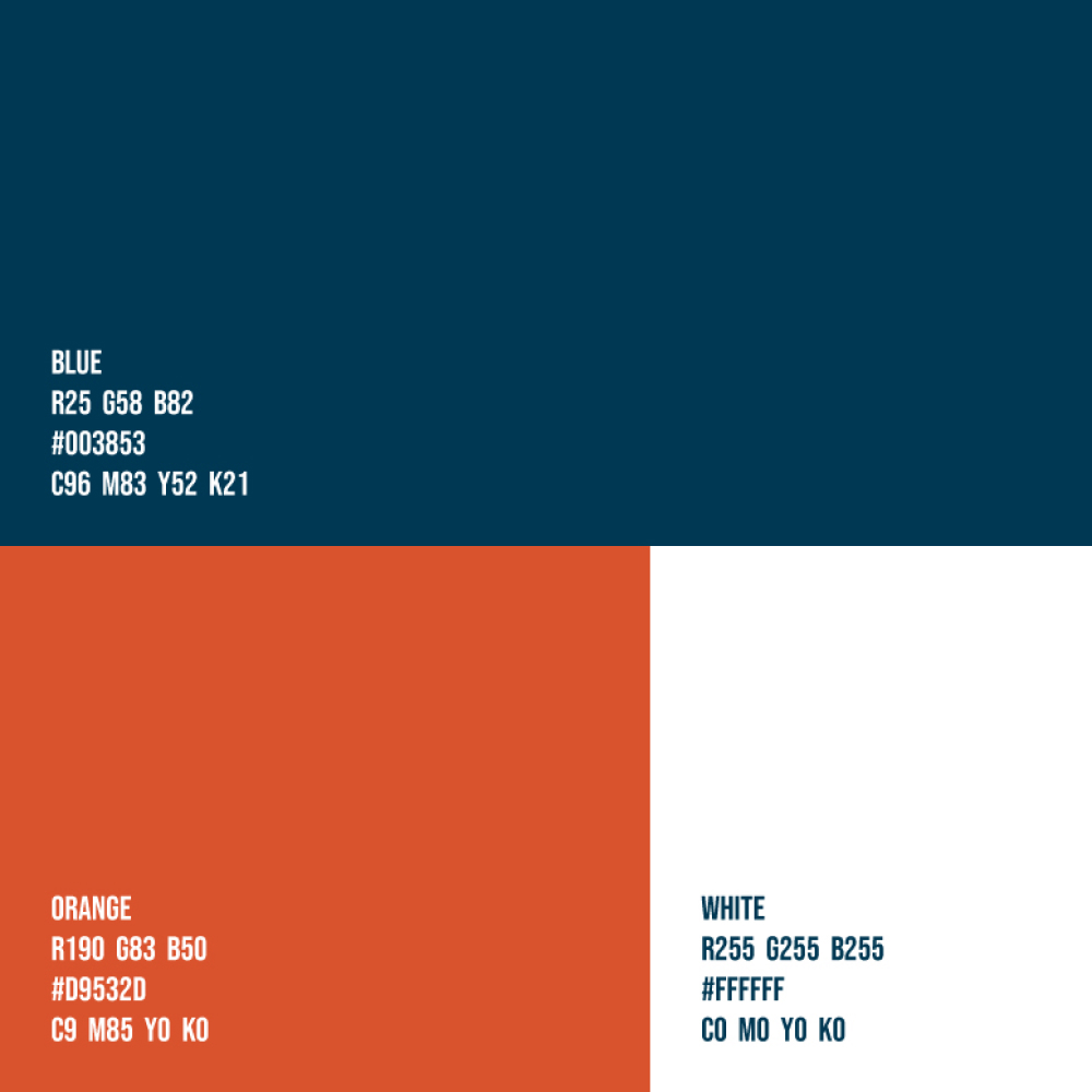
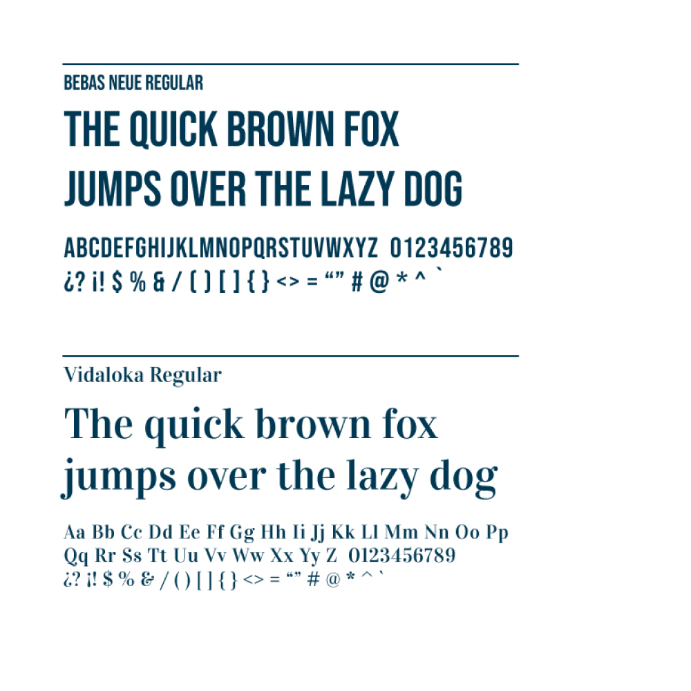

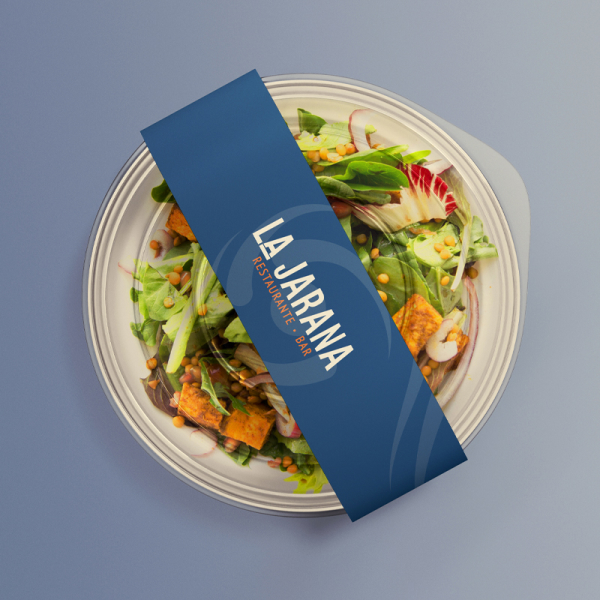
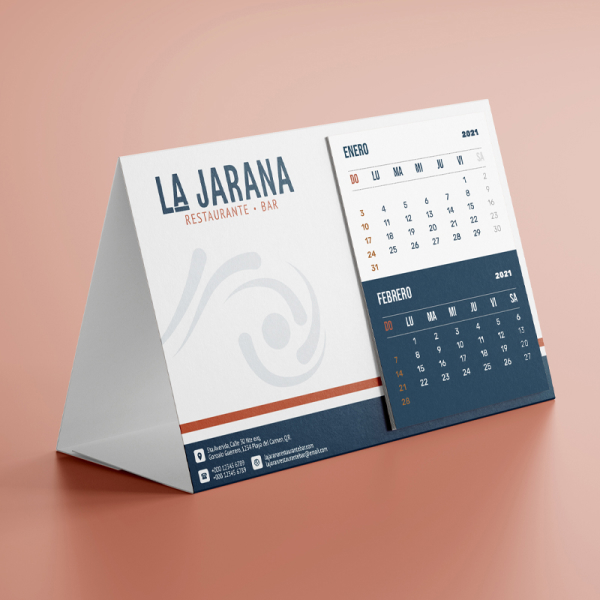
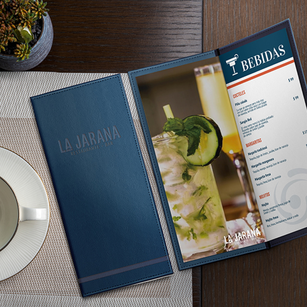
The color palette as well as the graphic elements that accompany the brand communicate elegance and exclusivity without losing the festive touch. These elements can be adapted to different brand presentation formats, such as menus, signage, packaging and more, ensuring coherence and visual appeal in every detail.
